Working with a large number of samples and many variables can be especially challenging. In our research, we typically have a few thousand variables (identified molecular formulas from mass spectra) for just a few samples. But recently, we stepped up our game and started working with a dataset that had 42 samples and close to 6000 variables.
To review the data for quality assurance, we use a combination of qualitative and quantitative measures. The qualitative assessment is best done by plotting the data a few different ways and then reviewing them for inconsistencies. Often the inconsistencies are incorrectly assigned molecular formulas. So to proceed, we first filter the data to remove formulas that are chemically unreasonable (e.g, hydrogen-to-carbon ratios < 0.3 are highly unlikely). However there are other molecular formulas that are within the chemical boundaries, but are quite dissimilar from the others. So, to find those, we have to manually review the data. This requires preparing 3 different plots (a reconstructed mass spectra of the assigned molecular formula masses, an elemental ratio plot (aka a van Krevelen diagram), and a Kendrick plot. This is a daunting task with 42 samples, so it’s at this point that you ask yourself, “Do I really have to copy and paste the same lines of code over and over again editing them each time to make these plots?”
Luckily the answer is “No”. As I recently discovered a very good model solution by Kevin Davenport on the r-bloggers website. I was immediately intrigued by this even though, I’m still a newbie with R and I’m not crazy about writing loops. Loops are often unnecessary in R, thanks in large part to the Apply family of functions. Regardless, the blog post by Kevin Davenport for automatically generating histograms was written sufficiently clear to be adapted here relatively easily. Below I describe the procedure with specific details that apply to our ultrahigh resolution mass spectrometry application.
The first step was to realize that the looping function requires input from a data frame that contains the sample data to be plotted without unnecessary columns. To prepare my data frame, I used the
select() function from
dplyr. My new data frame is called
ML_MS, which stands for Master List for Mass Spectra. This is a subset of
ML (Master List with all of the aligned formulas and formula details). To plot the mass spectra, I need the exact mass of the molecular formulas (
theor_mass) for the x-axis and the relative abundance of the ions that were observed in each of the samples. The relative abundance values are stored for each of the observations, which are labeled
S0625a through
S0728a. Note here that often molecular formulas are uniquely observed in a few observations, so each of the observations has many NA values.
.
ML_MS <- select(ML, theor_mass, group, S0625a:S0728a)
.
The next step is to write the looping function. I decided to call my function plotMassSpectra(). The function is defined to take in X data (where X represents the data frame to be assigned when applying the function in the last step) and ignore NA values. Then a vector list nm is created with the names of the columns from the data frame X, using the names() function. Then a for loop is used to iterate over all of the columns in the list nm, using the seq_along() function. The next step is to write the ggplot instructions and assign them to a temporary object (called plots). Notice that I used the aes_string() function rather than aes(). This means that you must place your variable names in quotes (in this case, “theor_mass” and “group”). The whole key to making this work is using the list nm to iterate over each of the samples. In this case, my y-axis information is the relative abundances stored in the individual columns of ML_MS. Thus, the y-axis is assigned to nm[i]. Note for plotting mass spectra, we need to assign the starting and end values (e.g., where y = 0 and yend = RA). Finally, you will want to write a save() function to save the plot to the directory. One additional step that I found to be especially helpful was to insert nm[i] into the plot tittle and the plot file name. In this way, there is a clear record of what data were plotted in each of the graphs.
.
plotMassSpectra <- function(X, na.rm = TRUE, ...) {
nm <- names(X)
for (i in seq_along(nm)) {
plots <-ggplot(X, aes_string(x = "theor_mass", xend = "theor_mass", y = 0, yend = nm[i])) + geom_segment(aes_string(color = "group")) +
labs(x = "m/z", y = "Relative Abundance", title = paste("Reconstructed Mass Spectra", nm[i], "- QA1", sep = " "))
ggsave(plots, filename = paste("MS_", nm[i], ".jpg", sep=""))
}
}
.
Now to execute the function on the prepared data frame, call the new function.
.
plotMassSpectra(ML_MS)
.
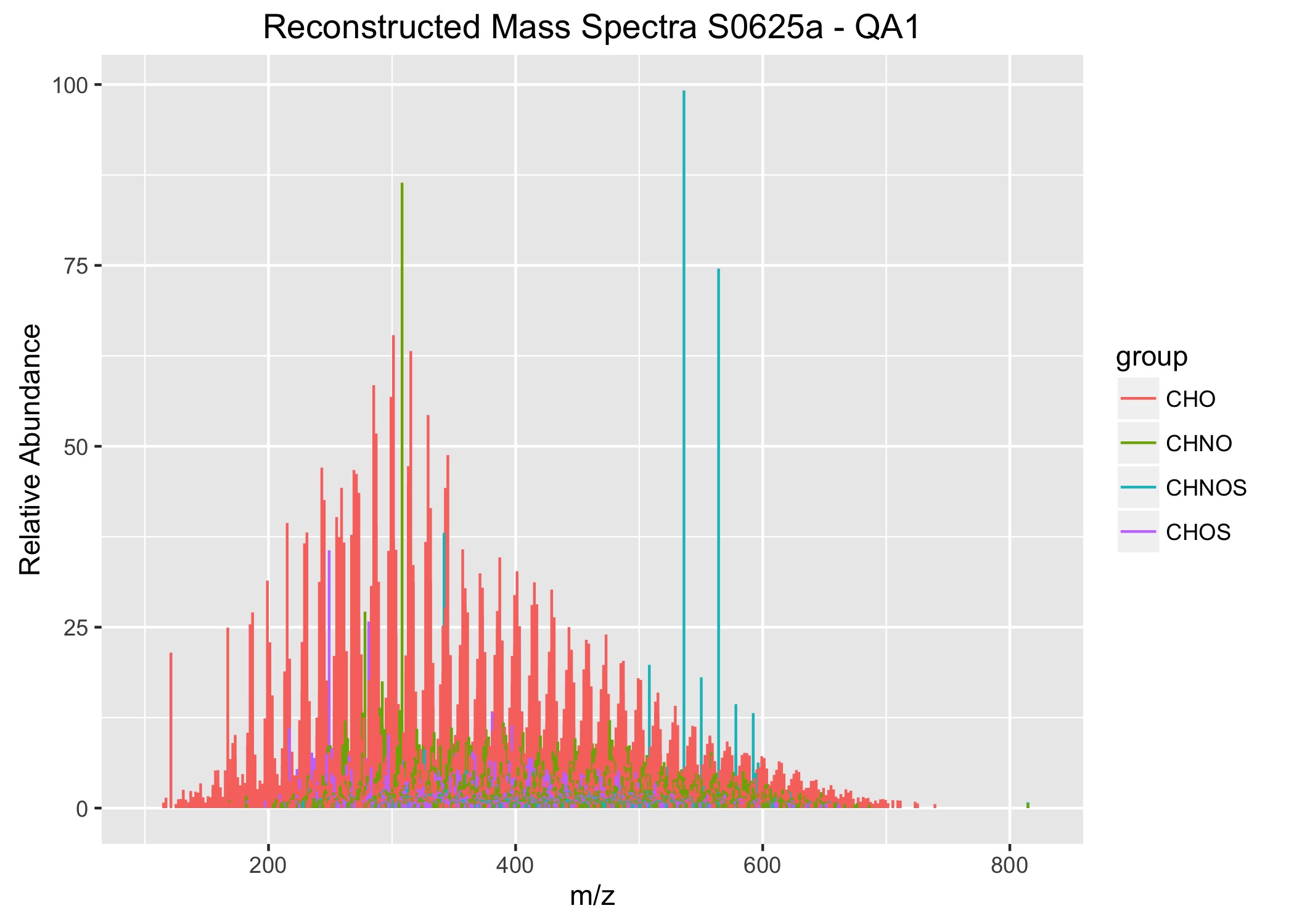
An example of the output from the plotMassSpectra function.
.
In my first several attempts, I got various error messages. I resolved them one by one and then finally saw the files being written to the directory. After tweaking the looping function a few times. For example, I added color to the mass spectra which are defined by group which is a factor. Note that my nm list includes a few columns which are required for the plot, but are not suppose to be assigned to the y-axis, thus I get 2 additional plots that I manually delete later.
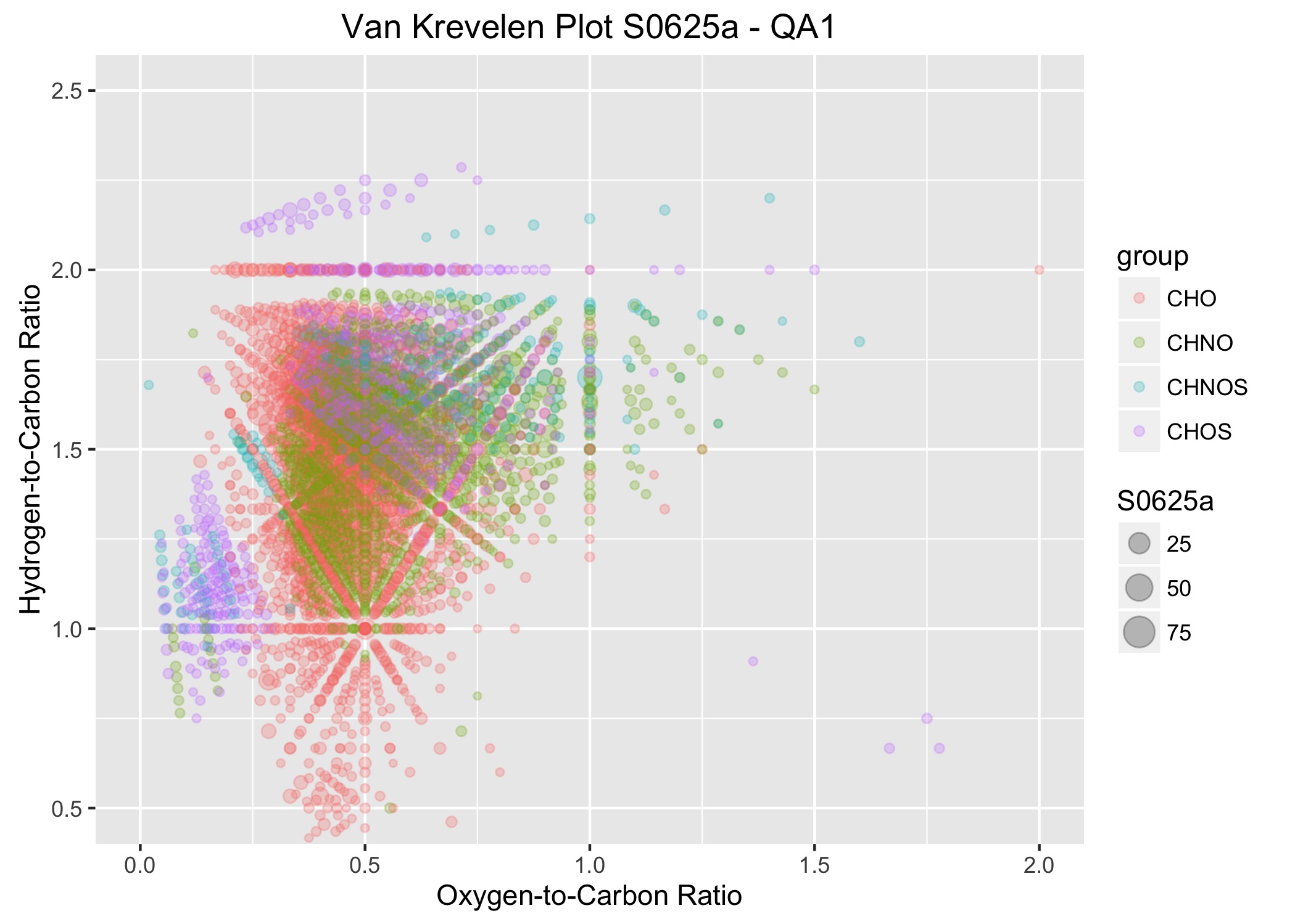
The same procedure was adapted for the next plot, which is used to examine the elemental ratios. In this plot, the oxygen-to-carbon ratios (O_C) of the molecular formulas are plotted on the x-axis and the hydrogen-to-carbon ratios (H_C) are plotted on the y-axis. To examine the specific points of interest and see their relative abundance, the symbols are scaled to the relative abundances for each of the observations (S0625a through S0728a). Similar to above, a specific data frame was created which stores the necessary data. It’s called ML_VK for Master List for van Krevelen plots.
.
ML_VK <- select(ML, group, O_C, H_C, S0625a:S0728a)
.
The looping function is similar to that given above. Again, X is the place holder for the data of the data frame to be supplied when the function is executed. Like above, the key to making this work is the list, defined as nm. It’s used in several points below.
.
plotVK <- function(X, na.rm = TRUE, ...) {
nm <- names(X)
for (i in seq_along(nm)) {
plots <-ggplot(X, aes_string(x = "O_C", y = "H_C")) +
geom_point(aes_string(color = "group", size = nm[i]), alpha = 1/4) +
coord_cartesian(xlim = c(0, 2.0), ylim = c(0.5, 2.5)) +
labs(x = "Oxygen-to-Carbon Ratio", y = "Hydrogen-to-Carbon Ratio", title = paste("Van Krevelen Plot", nm[i], "- QA1", sep = " "))
ggsave(plots, filename = paste("VK_", nm[i], ".jpg", sep=""))
}
}
.
plotVK(ML_VK)
.

An example from the plotVK function.
.
Similarly, you can adapted the second looping function to make the Kendrick plots. After successfully executing these functions, it’s time to start reviewing the plots. I placed the files into a powerpoint file, to review them one by one. However, these looping functions can be altered to be used in an
R Markdown document. Thus
saving even more time! Here’s an example (notice
ggsave() was replaced with
print()):
.
plotMassSpectra <- function(X, na.rm = TRUE, ...) {
nm <- names(X)
for (i in seq_along(nm)) {
plots <-ggplot(X, aes_string(x = "theor_mass", xend = "theor_mass", y = 0, yend = nm[i])) + geom_segment(aes_string(color = "group")) +
labs(x = "m/z", y = "Relative Abundance", title = paste("Reconstructed Mass Spectra", nm[i], "- QA1", sep = " "))
print(plots)
}
}
.